Showing posts with label Question 1. Show all posts

Tuesday, 16 April 2013

Gracious R Tapa- Evaluation Question 1 : In what ways does your media product use, develop or challenge forms and conventions of real media products?

 
The Title of the film :
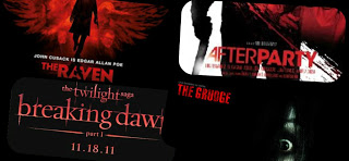
 
- For our Title 'Bound To-get-her'  , we chose to conform to the media thriller title conventions as we are appealing to a more mainstream audience. After conducting our product research, we discovered that red and black are colours mostly used in thrillers as they contain strong symbolism behind them.We chose to have a black background as it is a powerful colour which evokes strong emotions and a feel of emptiness. Black is the colour most commonly associated with secrets, power, violence, evil and the end,which is why we thought it would work well within our thiller opening. We then used red as although red is commonly used to represent blood and death, we figured we could use it for the other meaning behind it which is passion,infatuation and fire.
 
Setting /Location
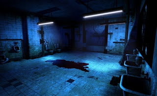
 
- Our opening was shot in 2 main locations, those being the toilets and a drama room. We overall wanted to create a feel of emptiness and isolation, and those 2 locations enabled us to achieve that ambience. We were able to manipulate the lighting in both locations to create the conventional dark lighting seen in thrillers. The gory suspenseful thriller 'Saw' had quite alot of dark lighting and is normaly set in 1 claustrophobic location which we thought we could echoe. We managed to  achieve the dark lighting by using black cloths and the built in lighting in the drama room. 
 
Props

 
 - As directors we chose to keep the props/mise en scene and the use of dialogue to a minimum in order to avoid complications and also focus of the acting and camera work. As our opening  is set in a school, we had to make sure that the constumes and the mise en scen communicated that. We had the female protagonist in her school uniform indicating her role and age, we also then had the janitor in a janitor's costume to correspond with his role as well as a trolly. The most important prop we used in the opening was the set of keys, which are also used in thrillers such as 'The Skeleton Key' . Keys represent power and allow you freedom but can also be used to lock and unlock secrets that you want to keep hidden, and we incoorperated them to portray that the female protagonist might be the Janitor's secret he wants to keep away from the world around him until he's ready to give her the keys for her to be able to unlock her future and fulfil her purpose.
 
Camera work and editing
 -The conventional camera shots and movement used in thrillers are
              
               
- Close ups for example in Hitchcock's psycho


- Pov shots for example in kill bill
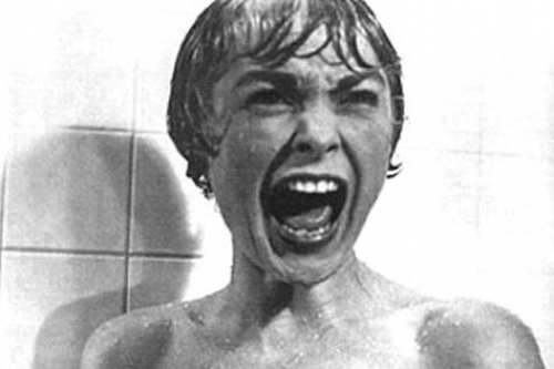


- By using our Storyboards to plan a variation of shots, we were able to use camera movements and angles such as tilts, pans, close ups and canted angles to keep the movement in our opening constant to ensure that it didnt become too repetitive and kept the audience engaged.

-Inspired by thrillers such as Shutter Island, Psycho and Seven we realised that we should not use too many long shots but instead to vary our shots and correspond them with the pace of the action. In post Production we found we had many long shots so we had to chose the best parts and cut them down, aswell as incude smooth transitions such as dissolve to make it more fluid.
 
Title Font and Style
 
- After doing some title research on the fonts and style for titles we decided to use a shattered and distorted font to represent the relationship between the characters. The font idea was similar to 'The Grudge' font which we altered and made our own. we did alot of research on the type of font and style we wanted and tried to insert complex and higly appealing animations to the font however we ran out of time and we still had not managed to perfect our skills on after effects. Therefore we went for a much more simpler font, style and animation.
 
Story and how the opening sets it up
 
our storyline is about a girl who gets bullied and a janitor kidnaps her in order to mentor her to get revenge on those who hurt her but at the end you can see the stockholm syndrome taking place. Our opening sets it up by :
- establishing the characters
- introducing us to the set and location the movie is going to be shot in
- and giving the audience an insight into the storyline through symbolism, and signs but in an ambiguous way therefore the audience can piece the pieces together.
 
Genre and how the opening suggests it
 
Our opening suggests the thriller Genre as elements such as these resemble those of a thriller :
- The dark, distorted music suggests that of a thriller as it foreshadows the trouble ahead. This is seen in thrillers such as Seven
- The dark and contrasting lighting, creating mystery and creating a dark atmosphere, suggesting the dark path ahead
- and the isolated , confined locations which represent abandonment and loss of hope aswell as help
 
How Characters are introduced
 
- in the beginning of the opening, the camera pans and finds a distraught small girl looking in the mirror. This hints to the audience that the story will centre around her, the flashbacks are then used so the audience get an insight on what she's been through and the abuse she's suffered. We then see a tracking shot of a man walking away from the camera but his face is not revealed until he looks in on the little girl in the bathroom. The fact that this man looks into a little girl suggests his psychologically disturbed nature and tells the audience that a relationship between these two characters is going to be formed.


Monday, 15 April 2013

Media Evaluation Question 1 - Anissa Daud

Question 1: In what ways does your media product use, develop or challenge forms and conventions of real media products?


1. The Title of the Film:

Possible titles for our film included 'Stockholm', 'Conjoined' 'Lex Talionis' and many others. We finally decided on 'BOUND' mainly because it was the one that wasn't already taken, but also because it was well-fitting, considering the plot.

The "to-get-her" section came about spontaneously; our fellow group member, Louisa, was editing the titles when she thought that there could be a double meaning within the title of our film.

For example, the word 'together' would insinuate that both the Janitor and Sophie are physically together, yet are also 'together' because they've both been victims of bullying. The word can also be broken up to form "to-get-her" - and this is the main aim of the Janitor, with regards to Sophie, the main protagonist.

A good Thriller usually includes some sense of enigma, as well as the idea of solving a riddle, and by including this, we feel that our title is quite conventional, as it is punning and implies more than just one thing.

Additionally, the colouring of our titles was extremely important and we thought that we should also make use of symbolism through the colouring. For example, the background is black, which implies darkness, mystery, evil, etc. It is also a colour which is used quite frequently within Thriller titles and so, it was a conventional use of colour on our part. The text itself is red; this displays a double meaning alongside the actual title - red stands for danger and blood, but it could also be used as a symbol of passion, which is also an element within our story.

In order to depict the relationship that the two protagonists share, we wanted a font that was disjointed, yet still connected in some manner. We did some titles research on dafont.com and browsed through the 'Distorted' category. We finally settled on the font 'Ruptured Sans' as we felt it helped to represent our plot the most. We downloaded the font, after which we opened the font on Adobe After Effects, in order to animate our Title appropriately. We had initially wanted to have a smokey introduction, so as to reinforce the idea of mystery and secrets, however, lack of time meant that we would have to leave out the smokey idea, however we then added a simpler, yet more effective, animation to it.


2. Setting/Location:

As we were only supposed to film within the school premises, we had limited choices for potential locations. However, the fact that our narrative required the backdrop of a school helped us to overcome that particular obstacle as we then made use of our two primary locations, which were the toilets and the drama room. We used the drama room because we knew it would be equipped with things that would further aid us in this project; for example, we made use of black material to filter the lighting - as low key lighting is usually used abundantly within Thriller films; another generic convention that we have adhered to. We also utilised the available lighting equipment in order to create an eerie atmosphere within the room. In the toilets, we ensured that the lights were off, however there was a lot of natural light coming in through the windows. This did not cause too much of a problem, as we later dimmed the brightness of the clips during the Editing process. 


                     We ensured that the lighting was dark, and that the main focus was on Sophie. 


                                                      Preparing for the bathroom shoot. 


3. The Plot & Characters: 

After much deliberation, we decided on the plot as being about a young schoolgirl who is the victim of bullying, who is abducted by the school Janitor so that he can "train" her to stand against those who have wronged her. He does this as he feels he can relate to her as he has also gone through similar experiences in his past and so feels that this is his chance to "rectify" that. Although at first Sophie is seen to resist all his attempts at "helping", she is gradually affected by the Stockholm Syndrome and ends up strongly sympathising with the Janitor.


The very first time that we see Sophie is through a smudged & distorted mirror. This already displays to the audience that there are some evident struggles that this girl is facing. This point is further reinforced by the flashbacks that are shown later on during the opening, when the audience are shown what kind of abuse she has been dealing with. This type of an introduction is quite conventional, as it intrigues the audience as to knowing why the character was introduced like so and what they could be hiding.


The first glimpse of a second character is through a long shot - we see the back of the Janitor & we understand that he will also have some role to play. There is some cross-cutting as the scene cuts from Sophie to the Janitor, then back to Sophie after which we see a face outside the toilet door, albeit covered by natural light shining through the window. The fact that his face is not totally seen carries on creating the sense of an enigma and also implies that some sort of secrets are being hidden. It also presents him as a potential 'dark' character. However, the fact that it is white light shining on him contradicts the previous fact and it could be argued that he is a "messiah" of sorts. These contradictory ideas play well into the plot, due to the fact that the Janitor is not wholly 'good' or 'evil', but is rather a shady character, whom the audience is wary of, which again, is quite a conventional idea.


4. Camerawork, Sound & Editing

We initially used our storyboards to plan what and how many camera shots/angles we would include in our Final Piece. This helped us to form a 'checklist', which we went through whilst shooting, ensuring that we were adding a decent and appropriate amount of camera angles within our Piece.

We wanted to ensure that we included a variety of camera shots within our Final Piece, in order to not only showcase our understanding of them, but to also challenge ourselves and to see how many we could include in correspondence with the pace of the film. Moreover, after doing our initial Product Research of films like Shutter Island, Psycho and Se7en, we realised that a variety of camera shots/angles were necessary. During the Post-Production stage, we realised that a lot of the footage we had consisted of a lot of long shots. We therefore tried to narrow them down, so as to use them only where appropriate and also to ensure that there was fluidity to our Opening through smooth, dissolve transitions.

                                                            One of our panning shots 


 5. Props

In order to avoid any complications/confusion, we decided to keep props and dialogues to a minimum. However, there were still some things we needed to take into consideration. For example, Sophie is a schoolgirl, and so therefore we had to ensure that she was wearing appropriate clothing; as our actress is also a schoolgirl, the uniform was not an issue. However, as Mr Gibbs was playing the role of the Janitor, we had to request the appropriate uniform and trolley beforehand, in order to avoid wasting any time on the day of the shoots.


Janitor's Outfit


The trolley used by the Janitor
                                                                                                 

Louisa Cheung: Evaluation 1) In what ways does your media product use, develop or challenge forms and conventions of real media products?


Lighting
Within the final piece, the conventions used are generic to the thriller film genre. Many adjustments were made during filming and also whilst editing the opening sequence.The The contiual use of low key lighting is used as it reveals an unclear, unresolved sense of enigma. It is also seen in other thriller movies and the effect of this is not to reveal as much as possible at the start of the film to which therefore grasps the attention of the audience.
Similarly in Fight Club, you can't make out the location and scenery of where the characters are. The shots taken with low key lighting, somehow translated grainy on screen which is a disappointment however you could interpret the graininess of the footage to be confusing and unresolved which in turn reflects the relationship.  
The use of the tinted red lighting in the shot where the caretaker walks in which shines on the left side of his face is used to symbolise evil and therefore could represent the unknown insanity of the care taker. The colour red itself is a liminal colour because it could represent the love and warmth within the couples relationship and the cynical, corrupt views on the relationship.
Drama class
School Toilets
Setting/Location
Outside the school toilets
For deciding the locations of where to shoot, we were restrained and therefore when coming up our treatment,factors such as location and actors also had to be taken into account.
School's humanities corridor.
However we took it to our advantage as our target audience is age 15 and up,we thought our audience could relate to the setting and scenario. They may have either witnessed bullying or they may have been a victim to bullying.


Titling
 We found that looking at other thriller posters and titling, quite a few used both black and red. The emphasis is therefore put on the name of the film. The boldness of the colour red is almost an alert,   a pre-warning to what is to happen in the film. We used this convention and embedded
Bound To-Get-Her.
 in our title sequence. At first we came up with the title Bound as it was referring to the couples relationship. However I thought of including a play on word which was To-Get-Her. The reason behind this is because it reflects what the care taker is feeling. On one hand, he has to capture the girl and therefore has to get her, but also the fact that in the end they would end up together.
The Care Taker
Sophie
 Mise-En-Scene  
Both our main characters are wearing clothing to which is not out of the ordinary and also to which our mainstream audience can recognise. Other props used when filming the opening are ropes, the trolley the care taker uses and the keys to the classroom. By listing these series of props, you can tell they are referred to some sort of kidnapping.


 Introducing the characters
 When we are first introduced to both characters, their faces are both distorted one with a smudged mirror reflection and the other with the natural glare of lighting. This reflects that both characters have a troublesome life to which if we were to film the whole movie, we would be able to find out     why.

As said in our Treatment we would include elements of the Fritzl case and Stockholm syndrome, it challenges what viewers expect to be the ending of the thriller. When doing our audience research, when asked what is expected of a thriller movie the majority answered with a twisted unexpected ending which therefore our narrative does fit into their criteria.